Ingenius Arts by Moon creates thoughtful branding, websites, and digital experiences that help businesses grow.
Let’s Work Together Today
DISTINCTIVE BRAND IDENTITY
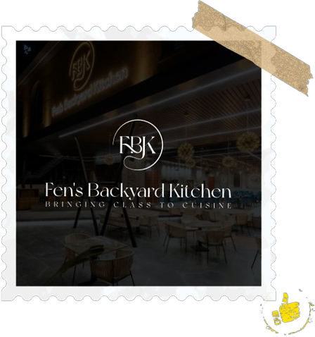
Meet Fens Backyard Kitchen
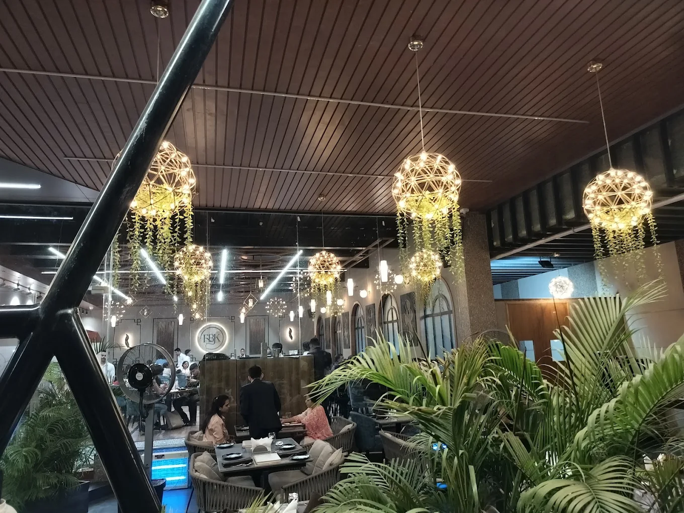
Fens Backyard Kitchen brings together delicious flavours, inviting ambience, and memorable dining experiences in one vibrant destination. With a diverse multi-cuisine menu and a welcoming atmosphere, FBK is designed for everything from casual get-togethers to special celebrations.
FBK was created as a refined culinary brand that combines the warmth of a personal dining experience with the sophistication of premium hospitality.
Experience-Driven Audience
The brand speaks to food lovers, professionals, families, and social diners who value great taste, inviting ambience, and visually memorable experiences.
Complete Brand Identity
The client needed a distinctive visual identity with a custom mark, colour palette, typography, and brand applications designed for consistent professional use.
Premium Yet Approachable
Our direction balanced elegance with warmth, creating a brand that feels sophisticated and high-quality while remaining welcoming, personal, and easy to connect with.
THE BRAND CHALLENGE
Defining the FBK Identity
The Core Challenge
FBK needed a warm, personal identity that still felt premium and exclusive, avoiding generic food symbols in a crowded market.
Warm & Personal
The brand needed warmth, authenticity, and connection to thoughtful food while remaining polished and professional.
Refined & Premium
It needed a sophisticated, confident presence reflecting high standards and competing with established premium culinary brands.
A Custom FBK Monogram
The FBK identity is built around a distinctive monogram instead of typical culinary symbols, using refined letterforms and a circular structure inspired by a dining plate to create a modern, memorable, and timeless mark that works consistently across menus, packaging, social media, and signage.
Defining FBK Identity
Who We Are Designing For
An audience that appreciates both flavour and strong visual appeal in equal measure.
The FBK identity combines monogram, stroke, typography into timeless system.
LETTERFORM MARK
The FBK monogram acts as a compact, memorable signature
for the brand.
CIRCULAR STOKE
References a dining plate the most fundamental culinary
FLOWING LETTERFORMS
Add movement and handcrafted quality to the mark.
SERIF TYPOGRAPHY
Strengthens premium positioning and gives the identity timeless character
APPLICATION LOGIC
Designed to support horizontal, stacked, end-mark and standalone-monogram arrangements. The monochrome system ensures reliable reproduction across print, digital, embossing and foil stamping.
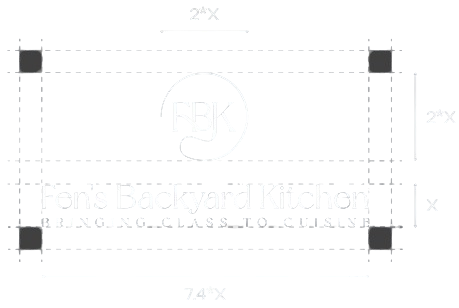
LOGO GRID SYSTEM
The Fen’s Backyard Kitchen logo is built on a precise grid system for balanced proportions and consistent alignment.
The custom FBK monogram, circular stroke, wordmark and tagline follow a unified structure, ensuring reliable use across print and digital applications.
Inspired by a dining plate, the circular form frames the flowing serif letterforms while maintaining the logo’s clarity, elegance and premium character.
Base Unit X: Primary Wordmark / Monogram Reference Height Monogram Height: 2*X Monogram Width: 2*X Wordmark Width: 7.4*X